Branding + Identity


PROJECT: TRIFEXIS BRAND REFRESH
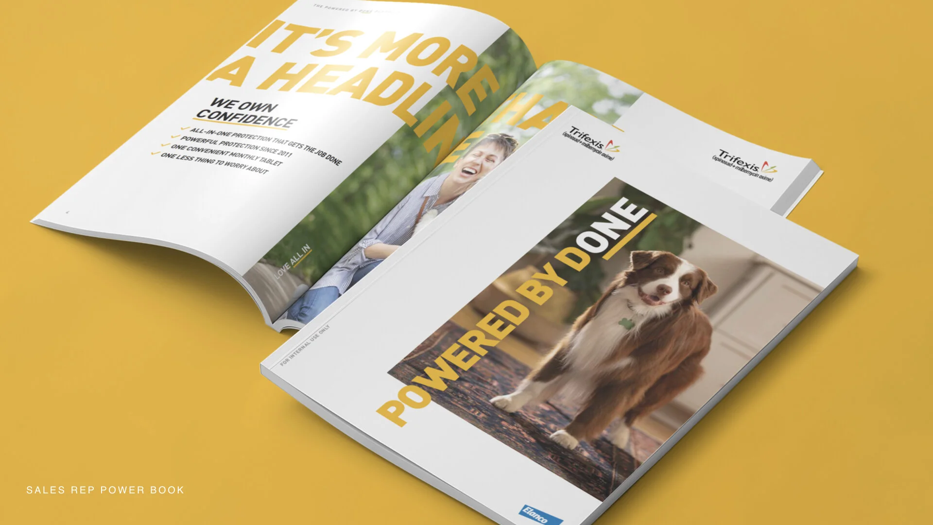
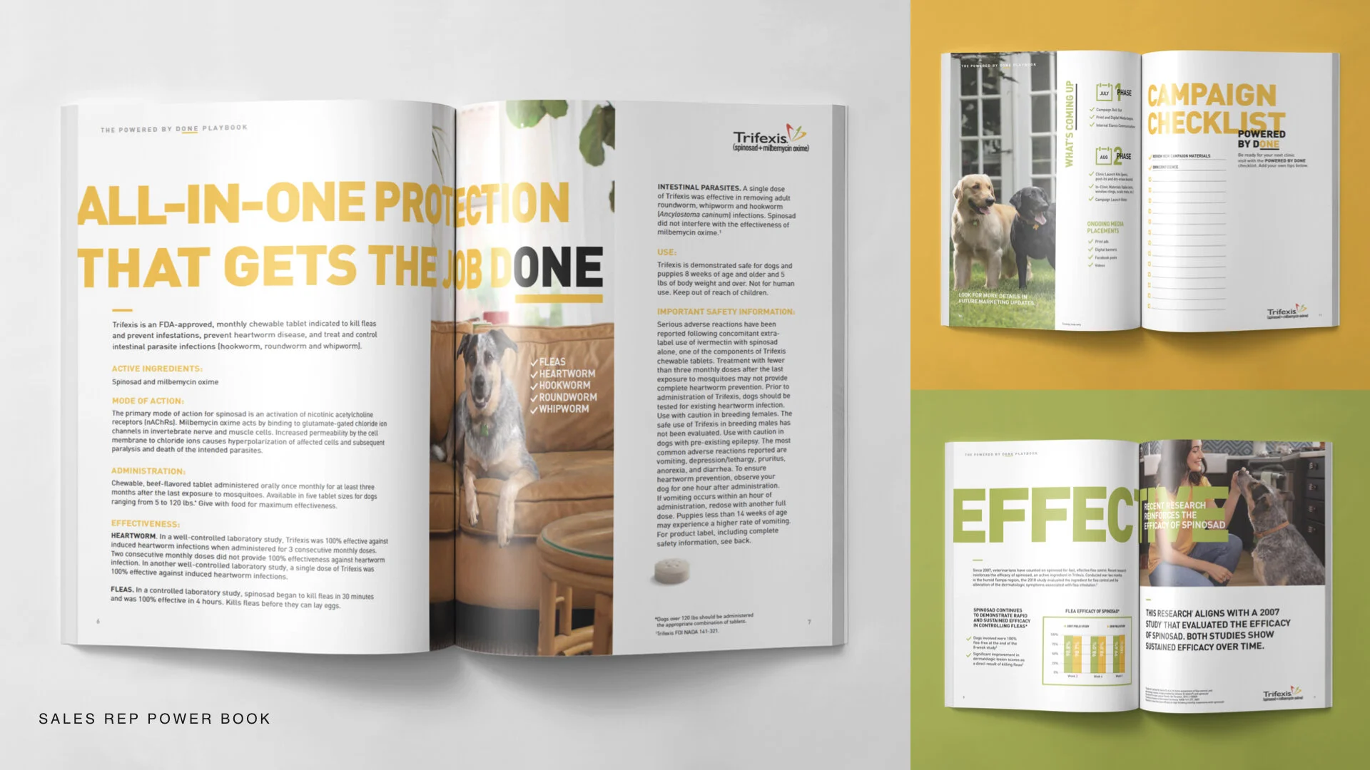
Trifexis is a monthly chew tablet that protects dogs against fleas and parasites, and it needed a brand refresh that would appeal to both veterinarians and consumers. Andrea Corless, Sr. Art Director and I had a month to create a compelling national campaign that would make veterinarians feel more confident prescribing Trifexis to their patients.
Marketing plans included a brand refresh, in-clinic materials, online multimedia ads, in-clinic videos, landing pages, distributor ads, and sales kit. We accomplished all of this, including a photo shoot within the time allowed. Needless to say, we were very pleased with the outcome as was the client.


PROJECT: MULTI-USE ACCOUNT TOOLBOX
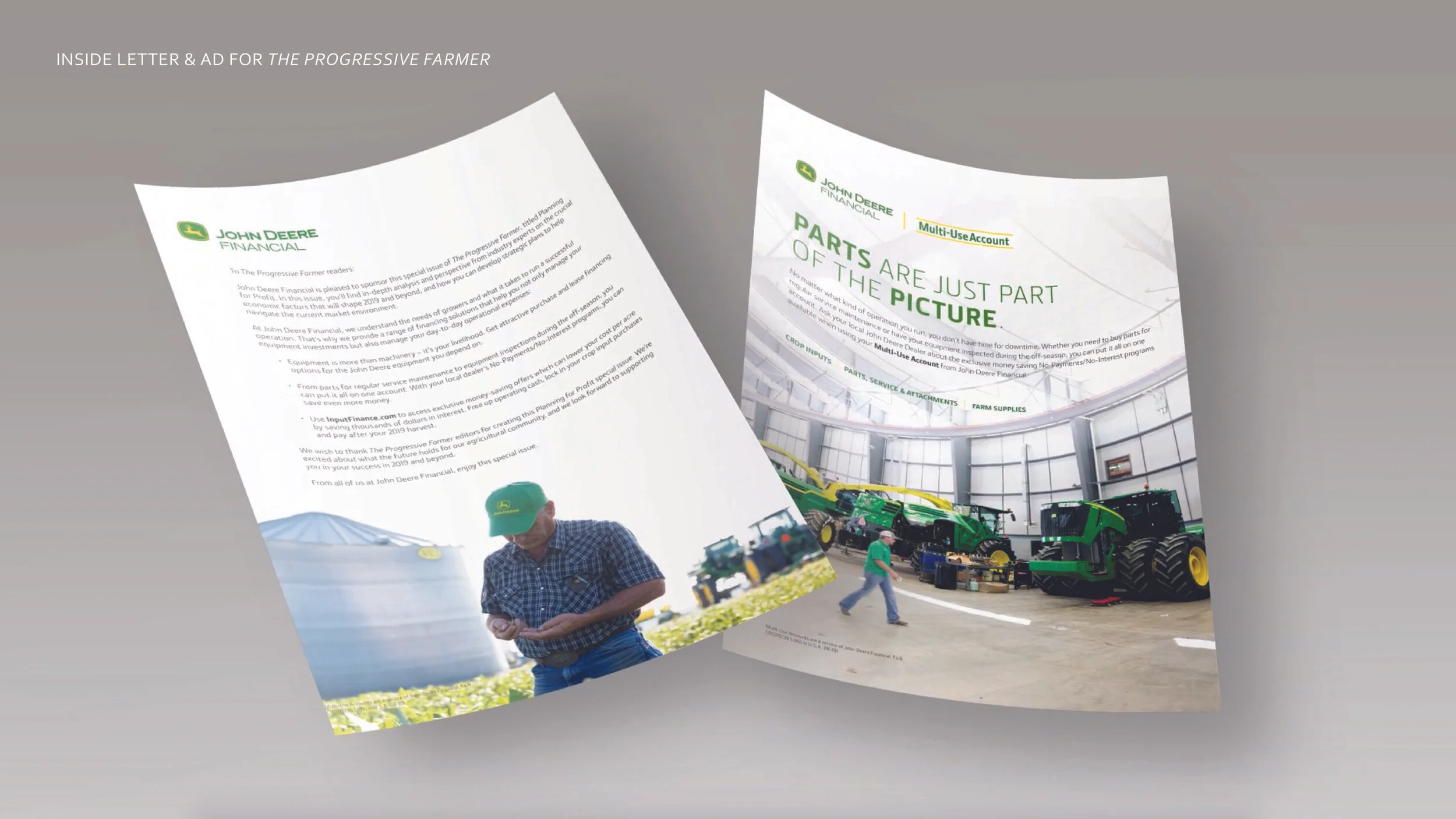
John Deere Financial wanted to provide merchants and dealers marketing tools and promotional materials to get more Multi-Use Account users into their stores. This video captures the full campaign execution. This kit contained: radio spots, on-hold messages, direct mail, email, paid page posts, newsletter and print ads for publications. Each of the marketing materials could be customized with the merchants’ and dealers’ contact information. This toolbox was key to continue the success of the rebranding the Multi-Use Account.


IDENTITY: LOGO & INTERIOR DESIGN
Located in the North Crossroads district of Kansas City, SoT is an elevated cocktail bar with small plates. The identity is inspired by a secret society of people that wanted to gather in a private place. The symbolism of the key fit perfectly along with a modern typeface evoked elegance and simplicity. Every element from the front door sign to the key logo in drinks entices you to feel notable and honored to be part of this social society.


PROJECT: FUTURE FEST BRAND IDENTITY
Future Fest is a day of innovation and education for high school students and their families that required an identity. The event showcased high-level technology that they created in an environment that encourages participation, exploration, and learning.
Just as students first start a project by learning the basics, the identity was created using basic learning blocks to create a form. The negative space of the square that forms the to “F”s coming together symbolizes an electric plug because everything featured at the festival involved electricity and students were empowered to use electricity in each of their projects on display. The typeface selected is futuristic and plays off the negative space of the letterforms.

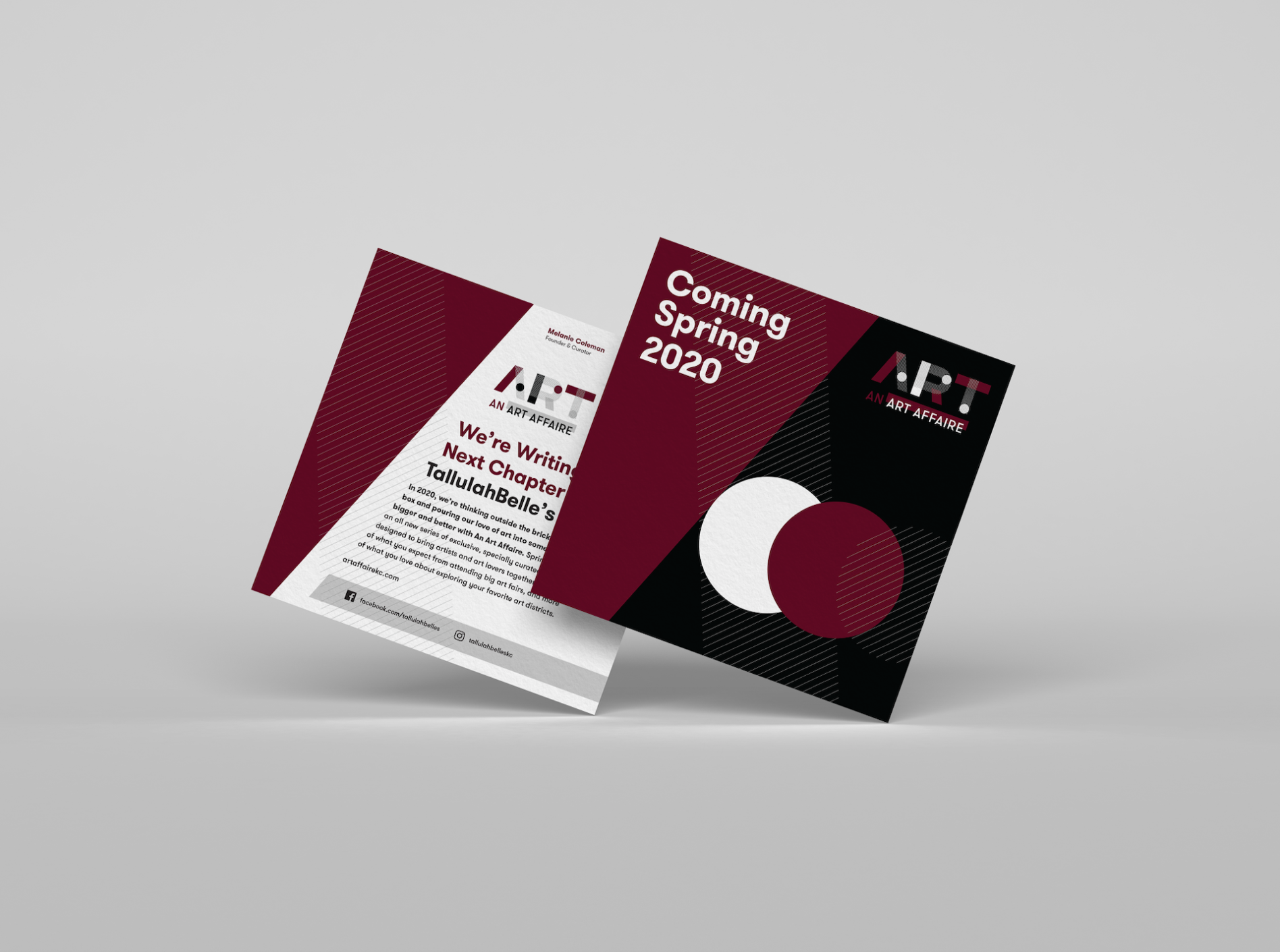
PROJECT: LOGO DEVELOPMENT FOR A POPUP FINE ART ESTABLISHMENT
The concept as we know the idea is no longer a brick and mortar building but more of a modular event that can bring art to various locations. This approach builds upon your network of art buyers and lovers. Colors and patterns and location imagery could all be incorporated. Patterns of the basic “A” geometric shape to create its own version of art and will be used for future advertisements.