Art Direction

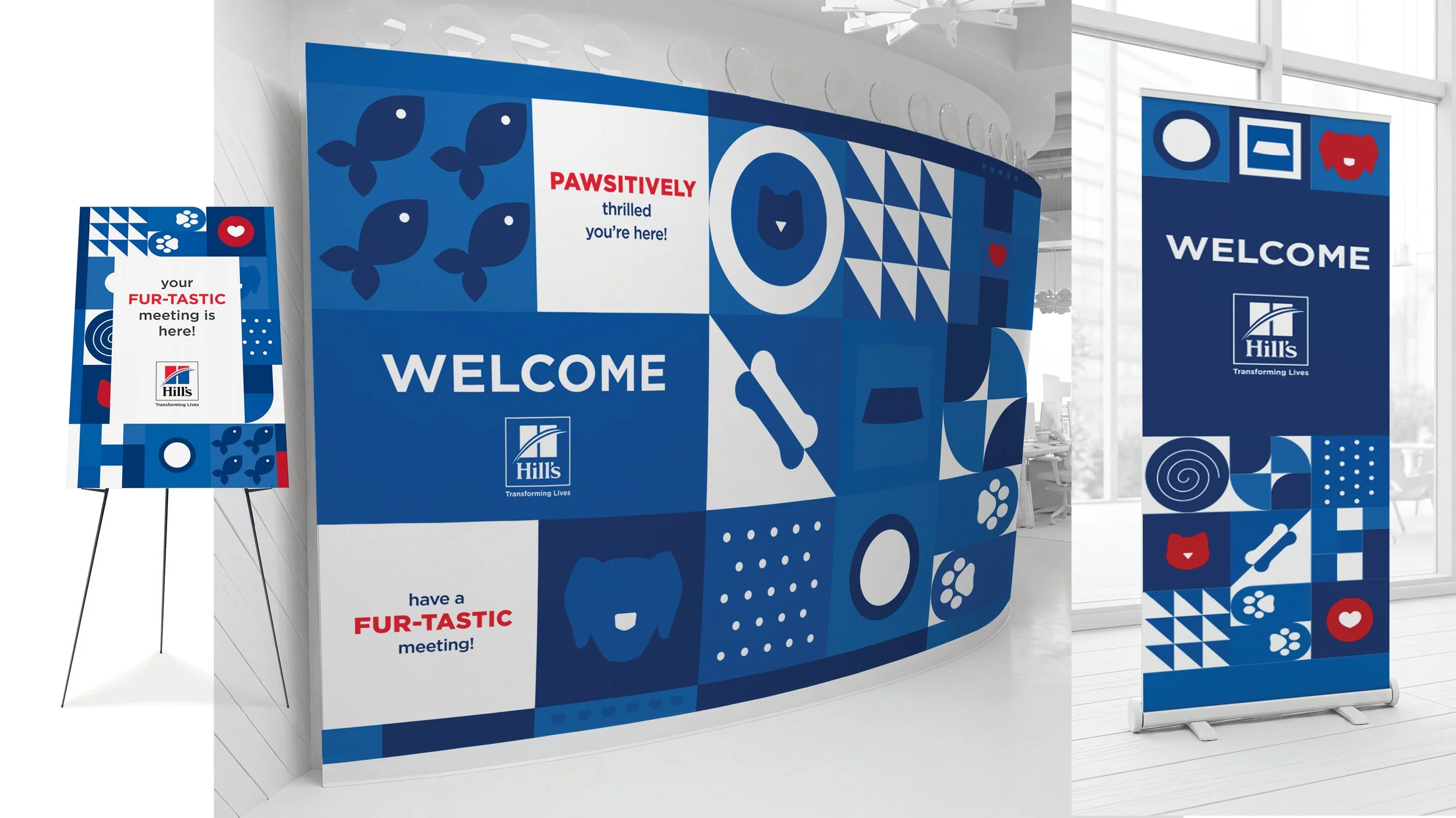
To welcome Hill’s to VML, I created a playful, pet-inspired signage system designed to feel warm, vibrant, and inviting from the moment guests arrived. Using Hill’s brand colors and fully vector-based artwork, the pieces brought a fun, polished energy to the space while staying visually cohesive and brand-aligned. The full set included a large-scale wall mural, a pull-up banner, and an easel sign, each designed to work together as part of a welcoming environmental experience.


PROJECT: “EVEN USED, NOTHING RUNS LIKE A DEERE” CAMPAIGN AD
In tough economic times, farmers can’t always afford to buy new equipment. By demonstrating how John Deere Used Equipment delivers equal performance and reliability as new equipment this concept speaks to the legendary quality John Deere is known for by utilizing its brand promise.

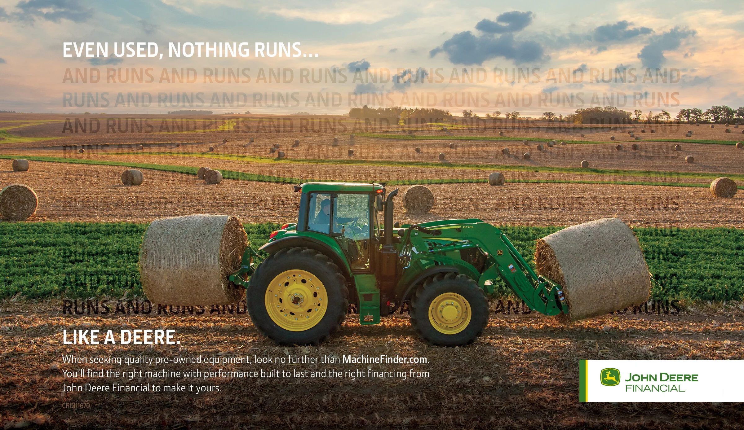


Everything you need for the day when you get in your combine.
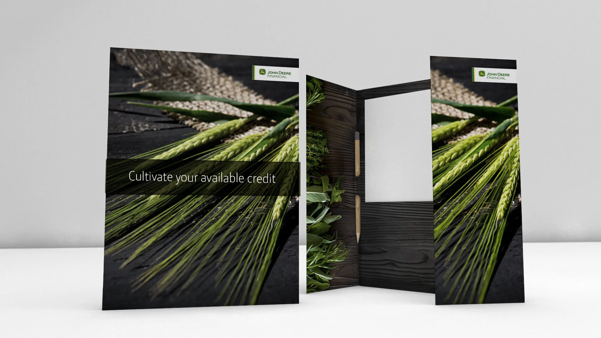
PROJECT: CUSTOMER DIRECT MAIL
Not only does John Deere sell equipment, but they also offer their customers a full range of financial tools known as the Multi-Use Account, which is essentially an operating line of credit. Our objective was to help John Deere VIP customers maintain their Multi-Use Accounts by collecting current financial information using hand-written inputs via snail mail.
We wanted to compel customers to respond by crafting an intriguing communication and rewarding them with a thoughtful, useful gift that demonstrates John Deere’s appreciation and respect. Farmers received this mailed folder with the necessary forms to fill out and return to John Deere. A “plantable” pencil was included. When planted in soil, the pencil grows into a specific herb, which is why we chose the herb visual for the inside of the folder.


PROJECT: SERESTO PRODUCT LAUNCH
Bayer Animal Health was launching a new 8-month collar for dogs and cats to protect them from fleas and ticks. With so many products on the market, this campaign needed to stand out and stop competitors in their tracks.
Weird things happen when concepting. I was distracted by a car commercial on TV. Little did I know the influence it left on me. I kept thinking about the luxury and power of this car and this collar. The circular nature of the collar and the circular elements of the car were an easy connection. This was the perfect visual way to communicate the power of this collar and the ease-of-use. All graphics were CGI to create the car and collar concept.


This is a fun medium to work in because of the endless possibilities. You can go gorilla-style with your creative or keep it traditional with a billboard. Either way, this is a great opportunity to make an impact. I’ve enjoyed working in this medium because it changes the way you think about design. Simplicity is key with typography and visuals. I’ve worked on wrapping cars to public transportation vehicles. It’s always fun to present to the client because they can look at marketing in a new way.


Union Gas in Canada wanted to create buzz around switching to paperless billing. This social post was on FaceBook and Instagram.

PROJECT: COLD BREW POSTER
With its ongoing expansion into more retail locations, Kansas City’s The Roasterie continues to add more product offerings. With the launch of Cold Brew, they need point-of-purchase posters to promote the new product. This is one in a series of posters I created that feature a different coffee bean from around the world.


